📖 Background
You work for an energy company in Australia. Your company builds solar panel arrays and then sells the energy they produce to industrial customers. The company wants to expand to the city of Melbourne in the state of Victoria.
Prices and demand for electricity change every day. Customers pay for the energy received using a formula based on the local energy market’s daily price.
Your company’s pricing committee wants your team to estimate energy prices for the next 12-18 months to use those prices as the basis for contract negotiations.
In addition, the VP of strategy is researching investing in storage capacity (i.e., batteries) as a new source of revenue. The plan is to store some of the energy produced by the solar panels when pricing conditions are unfavorable and sell it by the next day on the open market if the prices are higher.
💾 The data
You have access to over five years of energy price and demand data (source):
- “date” - from January 1, 2015, to October 6, 2020.
- “demand” - daily electricity demand in MWh.
- “price” - recommended retail price in AUD/MWh.
- “demand_pos_price” - total daily demand at a positive price in MWh.
- “price_positive” - average positive price, weighted by the corresponding intraday demand in AUD/MWh.
- “demand_neg_price” - total daily demand at a negative price in MWh.
- “price_negative” - average negative price, weighted by the corresponding intraday demand in AUD/MWh.
- “frac_neg_price” - the fraction of the day when the demand traded at a negative price.
- “min_temperature” - minimum temperature during the day in Celsius.
- “max_temperature” - maximum temperature during the day in Celsius.
- “solar_exposure” - total daily sunlight energy in MJ/m^2.
- “rainfall” - daily rainfall in mm.
- “school_day” - “Y” if that day was a school day, “N” otherwise.
- “holiday” - “Y” if the day was a state or national holiday, “N” otherwise.
Note: The price was negative during some intraday intervals, so energy producers were paying buyers rather than vice-versa.
💪 Competition challenge
Create a report that covers the following:
- How do energy prices change throughout the year? Are there any patterns by season or month of the year?
- Build a forecast of daily energy prices the company can use as the basis of its financial planning.
- Provide guidance on how much revenue the energy storage venture could generate per year using retail prices and a 70MWh storage system.
Exploratory Data Analysis (EDA)
import seaborn as sns
sns.set_style('darkgrid')
import pandas as pd
df = pd.read_csv('energy_demand.csv',
                 parse_dates=['date'],
                 index_col = 'date'
                )
df.tail()
| demand | price | demand_pos_price | price_positive | demand_neg_price | price_negative | frac_neg_price | min_temperature | max_temperature | solar_exposure | rainfall | school_day | holiday | |
|---|---|---|---|---|---|---|---|---|---|---|---|---|---|
| date | |||||||||||||
| 2020-10-02 | 99585.835 | -6.076028 | 41988.240 | 26.980251 | 57597.595 | -30.173823 | 0.625000 | 12.8 | 26.0 | 22.0 | 0.0 | N | N |
| 2020-10-03 | 92277.025 | -1.983471 | 44133.510 | 32.438156 | 48143.515 | -33.538025 | 0.583333 | 17.4 | 29.4 | 19.8 | 0.0 | N | N |
| 2020-10-04 | 94081.565 | 25.008614 | 88580.995 | 26.571687 | 5500.570 | -0.163066 | 0.062500 | 13.5 | 29.5 | 8.4 | 0.0 | N | N |
| 2020-10-05 | 113610.030 | 36.764701 | 106587.375 | 39.616015 | 7022.655 | -6.511550 | 0.083333 | 9.1 | 12.7 | 7.3 | 12.8 | N | N |
| 2020-10-06 | 122607.560 | 75.771059 | 122607.560 | 75.771059 | 0.000 | 0.000000 | 0.000000 | 8.9 | 12.6 | 5.8 | 1.0 | N | N |
wrangling & cleaning
df.info()
<class 'pandas.core.frame.DataFrame'>
DatetimeIndex: 2106 entries, 2015-01-01 to 2020-10-06
Data columns (total 13 columns):
 #   Column            Non-Null Count  Dtype
---  ------            --------------  -----
 0   demand            2106 non-null   float64
 1   price             2106 non-null   float64
 2   demand_pos_price  2106 non-null   float64
 3   price_positive    2106 non-null   float64
 4   demand_neg_price  2106 non-null   float64
 5   price_negative    2106 non-null   float64
 6   frac_neg_price    2106 non-null   float64
 7   min_temperature   2106 non-null   float64
 8   max_temperature   2106 non-null   float64
 9   solar_exposure    2105 non-null   float64
 10  rainfall          2103 non-null   float64
 11  school_day        2106 non-null   object
 12  holiday           2106 non-null   object
dtypes: float64(11), object(2)
memory usage: 230.3+ KB
df.isna().sum()
demand              0
price               0
demand_pos_price    0
price_positive      0
demand_neg_price    0
price_negative      0
frac_neg_price      0
min_temperature     0
max_temperature     0
solar_exposure      1
rainfall            3
school_day          0
holiday             0
dtype: int64
Hardly any missing data. That is good, less imputing required.
df[(df.solar_exposure.isna() > 0) | (df.rainfall.isna() > 0) ]
| demand | price | demand_pos_price | price_positive | demand_neg_price | price_negative | frac_neg_price | min_temperature | max_temperature | solar_exposure | rainfall | school_day | holiday | |
|---|---|---|---|---|---|---|---|---|---|---|---|---|---|
| date | |||||||||||||
| 2015-06-11 | 143465.445 | 37.481829 | 143465.445 | 37.481829 | 0.0 | 0.0 | 0.0 | 5.7 | 14.0 | 8.3 | NaN | Y | N |
| 2017-11-26 | 108717.875 | 83.114514 | 108717.875 | 83.114514 | 0.0 | 0.0 | 0.0 | 19.4 | 28.3 | NaN | 3.4 | Y | N |
| 2018-10-09 | 116449.310 | 99.000749 | 116449.310 | 99.000749 | 0.0 | 0.0 | 0.0 | 16.1 | 17.9 | 7.2 | NaN | Y | N |
| 2018-10-10 | 109551.080 | 73.539698 | 109551.080 | 73.539698 | 0.0 | 0.0 | 0.0 | 10.1 | 16.5 | 20.0 | NaN | Y | N |
Label encoding of both holiday and school_day columns:
b = {'Y': 1, 'N': 0, 1: 1, 0: 0}
df.school_day = df.school_day.map(b)
df.holiday = df.holiday.map(b)
df.head()
| demand | price | demand_pos_price | price_positive | demand_neg_price | price_negative | frac_neg_price | min_temperature | max_temperature | solar_exposure | rainfall | school_day | holiday | |
|---|---|---|---|---|---|---|---|---|---|---|---|---|---|
| date | |||||||||||||
| 2015-01-01 | 99635.030 | 25.633696 | 97319.240 | 26.415953 | 2315.790 | -7.240000 | 0.020833 | 13.3 | 26.9 | 23.6 | 0.0 | 0 | 1 |
| 2015-01-02 | 129606.010 | 33.138988 | 121082.015 | 38.837661 | 8523.995 | -47.809777 | 0.062500 | 15.4 | 38.8 | 26.8 | 0.0 | 0 | 0 |
| 2015-01-03 | 142300.540 | 34.564855 | 142300.540 | 34.564855 | 0.000 | 0.000000 | 0.000000 | 20.0 | 38.2 | 26.5 | 0.0 | 0 | 0 |
| 2015-01-04 | 104330.715 | 25.005560 | 104330.715 | 25.005560 | 0.000 | 0.000000 | 0.000000 | 16.3 | 21.4 | 25.2 | 4.2 | 0 | 0 |
| 2015-01-05 | 118132.200 | 26.724176 | 118132.200 | 26.724176 | 0.000 | 0.000000 | 0.000000 | 15.0 | 22.0 | 30.7 | 0.0 | 0 | 0 |
df.corr()
| demand | price | demand_pos_price | price_positive | demand_neg_price | price_negative | frac_neg_price | min_temperature | max_temperature | solar_exposure | rainfall | school_day | holiday | |
|---|---|---|---|---|---|---|---|---|---|---|---|---|---|
| demand | 1.000000 | 0.217538 | 0.971377 | 0.215038 | -0.180638 | 0.057854 | -0.189839 | -0.156118 | -0.073216 | -0.257406 | -0.064609 | 0.123030 | -0.247683 |
| price | 0.217538 | 1.000000 | 0.220856 | 0.999821 | -0.078815 | 0.038931 | -0.077955 | 0.070619 | 0.165484 | 0.061808 | -0.028642 | -0.005014 | -0.030963 |
| demand_pos_price | 0.971377 | 0.220856 | 1.000000 | 0.214628 | -0.409102 | 0.120054 | -0.416573 | -0.147020 | -0.068146 | -0.229749 | -0.069696 | 0.136983 | -0.234809 |
| price_positive | 0.215038 | 0.999821 | 0.214628 | 1.000000 | -0.062631 | 0.029455 | -0.061968 | 0.071052 | 0.165663 | 0.061311 | -0.027860 | -0.006134 | -0.030697 |
| demand_neg_price | -0.180638 | -0.078815 | -0.409102 | -0.062631 | 1.000000 | -0.274847 | 0.995590 | 0.009030 | 0.000914 | -0.037467 | 0.040387 | -0.094577 | 0.020787 |
| price_negative | 0.057854 | 0.038931 | 0.120054 | 0.029455 | -0.274847 | 1.000000 | -0.258065 | -0.077248 | -0.033255 | 0.001654 | -0.020794 | 0.007775 | -0.004092 |
| frac_neg_price | -0.189839 | -0.077955 | -0.416573 | -0.061968 | 0.995590 | -0.258065 | 1.000000 | 0.008859 | -0.001174 | -0.036701 | 0.038527 | -0.096948 | 0.025606 |
| min_temperature | -0.156118 | 0.070619 | -0.147020 | 0.071052 | 0.009030 | -0.077248 | 0.008859 | 1.000000 | 0.705433 | 0.376261 | -0.003050 | -0.082904 | 0.066620 |
| max_temperature | -0.073216 | 0.165484 | -0.068146 | 0.165663 | 0.000914 | -0.033255 | -0.001174 | 0.705433 | 1.000000 | 0.598995 | -0.155392 | -0.092532 | 0.042487 |
| solar_exposure | -0.257406 | 0.061808 | -0.229749 | 0.061311 | -0.037467 | 0.001654 | -0.036701 | 0.376261 | 0.598995 | 1.000000 | -0.123568 | -0.095447 | 0.045224 |
| rainfall | -0.064609 | -0.028642 | -0.069696 | -0.027860 | 0.040387 | -0.020794 | 0.038527 | -0.003050 | -0.155392 | -0.123568 | 1.000000 | -0.013987 | -0.015024 |
| school_day | 0.123030 | -0.005014 | 0.136983 | -0.006134 | -0.094577 | 0.007775 | -0.096948 | -0.082904 | -0.092532 | -0.095447 | -0.013987 | 1.000000 | -0.170251 |
| holiday | -0.247683 | -0.030963 | -0.234809 | -0.030697 | 0.020787 | -0.004092 | 0.025606 | 0.066620 | 0.042487 | 0.045224 | -0.015024 | -0.170251 | 1.000000 |
Most variables are only weakly correlated to each other, except the price features among each other of course.
import matplotlib.pyplot as plt
fig, axes = plt.subplots(2, 1)
fig.suptitle('Demand and Price time series')
axes[0] = df.demand.plot(ax=axes[0])
axes[0].set_ylabel('demand')
axes[1] = df.price.plot(ax=axes[1])
axes[1].set_ylabel('price (log scaled)')
axes[1].set_yscale('log')
plt.show()
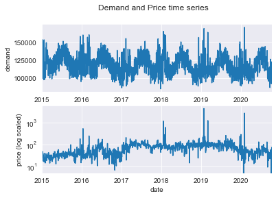
# create a few extra columns
import numpy as np
price_monthly = df.demand.asfreq('M')
df['month'] = df.index.month
df['quarter'] = df.index.quarter
df['week'] = df.index.isocalendar().week
df['weekdayname'] = df.index.day_name()
df['logprice_negative'] = df.price_negative.apply(lambda x: np.log(abs(x)) if x<0 else x)
1. How do energy prices change throughout the year? Are there any patterns by season or month of the year?
import numpy as np
sns.set(rc={"figure.figsize":(12, 20)})
fig, axes = plt.subplots(4, 1)
axes[0].set_title('Average Price distributions (log transformed) by quarter')
axes[0] = sns.boxplot(data=df, y=np.log(df.price), x=df.quarter, ax=axes[0])
axes[0].set_ylabel('Log Price')
axes[0].set_xlabel('quarter')
axes[1].set_title('Average Prices (log transformed) by month')
axes[1] = sns.boxplot(data=df, y=np.log(df.price), x=df.month, ax=axes[1])
axes[1].set_ylabel('Log Price')
axes[1].set_xlabel('month season')
weekdays = ["Monday", "Tuesday", "Wednesday", "Thursday", "Friday", "Saturday", "Sunday"]
axes[2].set_title('Average Prices (log transformed) per weekday')
axes[2] = sns.boxplot(data=df, y=np.log(df.price), x=df.weekdayname, order=weekdays,ax=axes[2])
axes[2].set_ylabel('Prices (log tranformed)')
axes[2].set_xlabel('weekday')
axes[3].set_title('Negative Prices only (log transformed & sign changed)')
axes[3] = sns.boxplot(data=df, y=df.logprice_negative[df.logprice_negative != 0 ], x=df.weekdayname, order=weekdays)
axes[3].set_ylabel('Negative Prices (log transformed & sign changed)')
axes[3].set_xlabel('weekday')
plt.show()
C:\Users\SD\anaconda3\envs\timeseries\lib\site-packages\pandas\core\arraylike.py:397: RuntimeWarning: invalid value encountered in log
  result = getattr(ufunc, method)(*inputs, **kwargs)
C:\Users\SD\anaconda3\envs\timeseries\lib\site-packages\pandas\core\arraylike.py:397: RuntimeWarning: invalid value encountered in log
  result = getattr(ufunc, method)(*inputs, **kwargs)
C:\Users\SD\anaconda3\envs\timeseries\lib\site-packages\pandas\core\arraylike.py:397: RuntimeWarning: invalid value encountered in log
  result = getattr(ufunc, method)(*inputs, **kwargs)
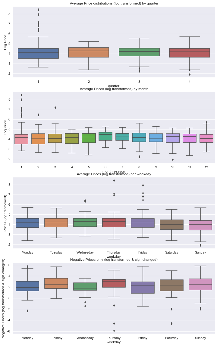
df.logprice_negative[df.logprice_negative != 0 ].count()
181
There are only 181 days on which the price turned negative at all, out of 2106 days of data. As we can see from belows chart that this price phenomenon takes on average more than double as long to be regressed on a day on weekend.
# frac_neg_price

avg_frac_neg_price_weekday = df.frac_neg_price.groupby(df.weekdayname).mean()

sns.set(rc={"figure.figsize":(14, 8)})
fig = avg_frac_neg_price_weekday[weekdays].plot(kind='bar', x='weekdayname',
                                #order=weekdays
                               )
fig.set_ylabel('fraction of time with negative prices')
fig.set_xlabel('weekday')
fig.set_title('Fraction of time with negative prices per weekday')
#plt.yscale('log')
plt.show()
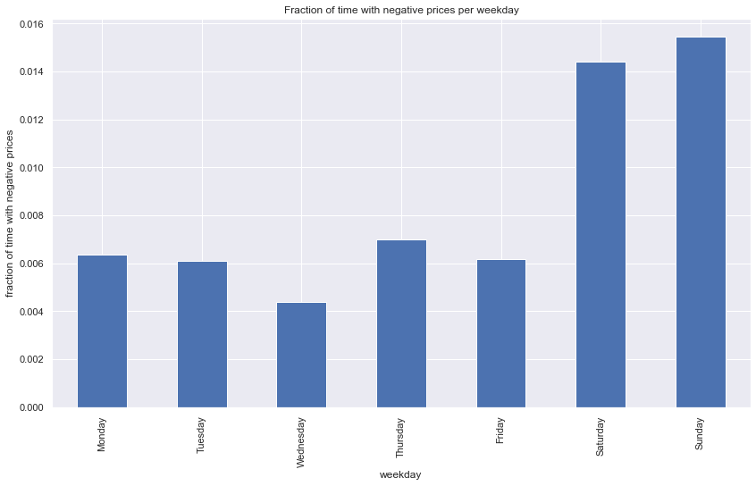
As we do not have the data for all the feature variables for the forecast horizon of 12/18 months, we will be not able to use any variables in the price forecasting models. While variables such as holiday and school_day may be easier to acquire and provide for these future days, others will be harder or impossible to acquire, as e.g. with weather data we would need to rely on forecasts as well, which are available on a few days maximum anyway.
sns.set(rc={"figure.figsize":(13, 7)})
fig, axes = plt.subplots(1, 2)

fig = sns.scatterplot(data=df, y=np.log(df.price), x='demand', hue='holiday',
                 ax=axes[0]
                 )

fig = sns.scatterplot(data=df, y=np.log(df.price), x='demand', hue='school_day',
                 ax=axes[1]
                 )
plt.show()
C:\Users\SD\anaconda3\envs\timeseries\lib\site-packages\pandas\core\arraylike.py:397: RuntimeWarning: invalid value encountered in log
  result = getattr(ufunc, method)(*inputs, **kwargs)
C:\Users\SD\anaconda3\envs\timeseries\lib\site-packages\pandas\core\arraylike.py:397: RuntimeWarning: invalid value encountered in log
  result = getattr(ufunc, method)(*inputs, **kwargs)
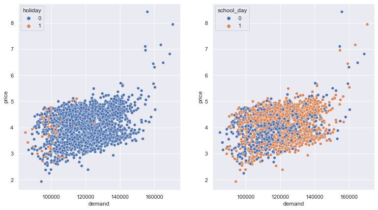
Price and demand are by nature positively correlated and interact with each other. This can be confirmed in a quick scatterplot. We want to use the demand timeseries also in our price forecast and therefore will model demand at first, forecast it and use this a extra feature variable in our price model.
2. Build a forecast of daily energy prices the company can use as the basis of its financial planning.
Formal timeseries stationarity check
# Import augmented dicky-fuller test function
from statsmodels.tsa.stattools import adfuller

# Run test
adfullertest_price = adfuller(df.price)
adfullertest_demand = adfuller(df.demand)

print(f'Price TS Adfuller test statistic {adfullertest_price[0]}')
print(f'Price TS Adfuller p-value {adfullertest_price[1]}')

print('##################')

print(f'Demand TS Adfuller test statistic {adfullertest_demand[0]}')
print(f'Demand TS Adfuller p-value {adfullertest_demand[1]}')
Price TS Adfuller test statistic -11.039525891900833
Price TS Adfuller p-value 5.4099030605776795e-20
##################
Demand TS Adfuller test statistic -3.953447482126237
Demand TS Adfuller p-value 0.0016748806784637172
Augmented Dikey Fuller Test (ADF)
Null Hypothesis: the presence of unit root = the series is non-stationary.
We can clearly reject the null hypothesis for the demand time series, we infer that it is stationary.
Forecasting demand with a Hybrid model: Linear Regression + XGBoost
We want to build a demand forecst model because both demand and prices strongly interact with each other not only in electricty markets. Demand may be a good feature to predict the price in our tasked question.
from sklearn.linear_model import LinearRegression
from sklearn.model_selection import train_test_split
from statsmodels.tsa.deterministic import CalendarFourier, DeterministicProcess
from xgboost import XGBRegressor
C:\Users\SD\anaconda3\envs\timeseries\lib\site-packages\xgboost\compat.py:36: FutureWarning: pandas.Int64Index is deprecated and will be removed from pandas in a future version. Use pandas.Index with the appropriate dtype instead.
  from pandas import MultiIndex, Int64Index
y = df.demand

# Create trend features
dp = DeterministicProcess(index=y.index, constant=True, order=2, drop=True)
X = dp.in_sample()  # I waived deliberately to use awkward out_of_sample function

# split the data
idx_train, idx_test = train_test_split(
    y.index, test_size=500, shuffle=False,
)
X_train, X_test = X.loc[idx_train, :], X.loc[idx_test, :]
y_train, y_test = y.loc[idx_train], y.loc[idx_test]
X_test
| const | trend | trend_squared | |
|---|---|---|---|
| date | |||
| 2019-05-26 | 1.0 | 1607.0 | 2582449.0 |
| 2019-05-27 | 1.0 | 1608.0 | 2585664.0 |
| 2019-05-28 | 1.0 | 1609.0 | 2588881.0 |
| 2019-05-29 | 1.0 | 1610.0 | 2592100.0 |
| 2019-05-30 | 1.0 | 1611.0 | 2595321.0 |
| ... | ... | ... | ... |
| 2020-10-02 | 1.0 | 2102.0 | 4418404.0 |
| 2020-10-03 | 1.0 | 2103.0 | 4422609.0 |
| 2020-10-04 | 1.0 | 2104.0 | 4426816.0 |
| 2020-10-05 | 1.0 | 2105.0 | 4431025.0 |
| 2020-10-06 | 1.0 | 2106.0 | 4435236.0 |
500 rows × 3 columns
# Fit trend model
model = LinearRegression(fit_intercept=False)
model.fit(X_train, y_train)
LinearRegression(fit_intercept=False)
# Make predictions
y_fit = pd.DataFrame(model.predict(X_train),index=y_train.index, columns=['demand'])
y_pred = pd.DataFrame(model.predict(X_test), index=y_test.index, columns=['demand'])
# Plot
plt.figure(figsize=(10,6))
axs = y_train.plot(color='0.25', subplots=True, sharex=True)
axs = y_test.plot(color='0.25', subplots=True, ax=axs)
axs = y_fit.plot(color='C0', subplots=True, ax=axs)
axs = y_pred.plot(color='C3', subplots=True, ax=axs)
for ax in axs: ax.legend([])
_ = plt.suptitle("Demand on downwards trend")
plt.show()
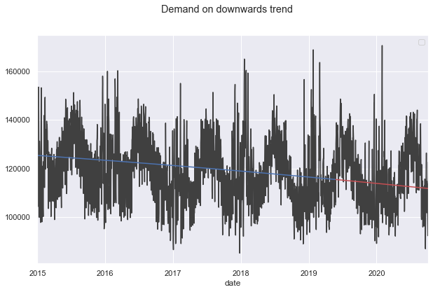
import numpy as np

def feature_engineer_X(X):
    X['dayofweek'] = X.index.dayofweek
    X['quarter'] = X.index.quarter
    X['month'] = X.index.month
    X['year'] = X.index.year
    X['dayofyear'] = X.index.dayofyear
    X['dayofmonth'] = X.index.day
    X['weekofyear'] = X.index.isocalendar().week.astype(np.int64)
    return X

X = feature_engineer_X(X)

# remove cols for XGB
tbd = ['const' , 'trend' , 'trend_squared']
for col in tbd:
    if col in X.columns:
        X.drop(tbd, axis=1, inplace=True)
        break

# Create splits
X_train, X_test = X.loc[idx_train, :], X.loc[idx_test, :]
y_train, y_test = y.loc[idx_train], y.loc[idx_test]
# Create residuals (the collection of detrended series) from the training set
y_resid = y_train - y_fit.demand # y_fit is DF
y_resid.tail()
date
2019-05-21     6304.855728
2019-05-22     6560.784812
2019-05-23     3670.415060
2019-05-24     3484.181472
2019-05-25   -10483.520954
Name: demand, dtype: float64
# Train XGBoost on the residuals
xgb = XGBRegressor()
xgb.fit(X_train, y_resid)

# Add the predicted residuals onto the predicted trends
y_fit_boosted = xgb.predict(X_train) + y_fit.demand
y_pred_boosted = xgb.predict(X_test) + y_pred.demand
C:\Users\SD\anaconda3\envs\timeseries\lib\site-packages\xgboost\data.py:250: FutureWarning: pandas.Int64Index is deprecated and will be removed from pandas in a future version. Use pandas.Index with the appropriate dtype instead.
  elif isinstance(data.columns, (pd.Int64Index, pd.RangeIndex)):
axs = y_train.plot(
    color='0.25', figsize=(15, 8), subplots=True,
)
axs = y_test.plot(
    color='0.25', subplots=True, sharex=True, ax=axs,
)
axs = y_fit_boosted.plot(
    color='C0', subplots=True, sharex=True, ax=axs,
)
axs = y_pred_boosted.plot(
    color='C3', subplots=True, sharex=True, ax=axs,
)
plt.legend(['observed demand (training)', 'observed demand (test)', 'demand fitted (training)', 'demand forecast (test)'])
plt.ylabel('Demand in MWh')
plt.show()
C:\Users\SD\AppData\Local\Temp\ipykernel_26628\873584967.py:4: UserWarning: When passing multiple axes, sharex and sharey are ignored. These settings must be specified when creating axes.
  axs = y_test.plot(
C:\Users\SD\AppData\Local\Temp\ipykernel_26628\873584967.py:7: UserWarning: When passing multiple axes, sharex and sharey are ignored. These settings must be specified when creating axes.
  axs = y_fit_boosted.plot(
C:\Users\SD\AppData\Local\Temp\ipykernel_26628\873584967.py:10: UserWarning: When passing multiple axes, sharex and sharey are ignored. These settings must be specified when creating axes.
  axs = y_pred_boosted.plot(
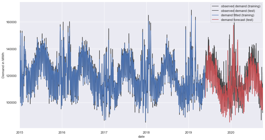
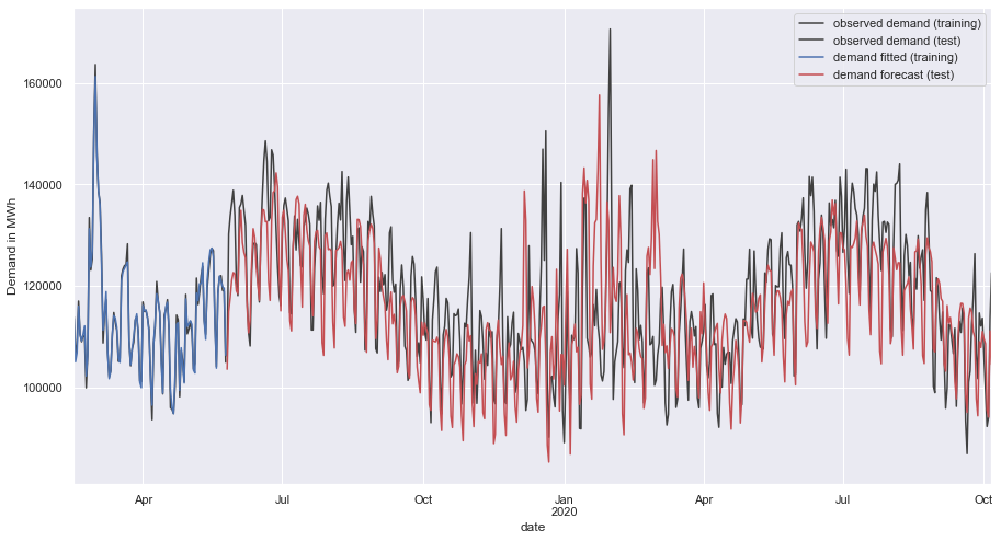
axs = y_train[-100:].plot(
    color='0.25', figsize=(15, 8), subplots=True, sharex=True,
    #title=['BuildingMaterials', 'FoodAndBeverage'],
)
axs = y_test.plot(
    color='0.25', subplots=True, ax=axs,
)
axs = y_fit_boosted[-100:].plot(
    color='C0', subplots=True,  ax=axs,
)
axs = y_pred_boosted.plot(
    color='C3', subplots=True,  ax=axs,
)
plt.legend(['observed demand (training)', 'observed demand (test)', 'demand fitted (training)', 'demand forecast (test)'])
plt.ylabel('Demand in MWh')
plt.show()
forecast full demand time series as new feature for price modelling
we train again, now with the full demand dataset and predict demand for our forecast horizon of 12 to 18 months
lr = LinearRegression(fit_intercept=False)
lr.fit(X, y)
y_lr = lr.predict(X)

y_resid = y - y_lr
y_resid

xgb = XGBRegressor()
xgb.fit(X, y_resid)
y_xgb = xgb.predict(X)

y_demand_fitted = pd.DataFrame(
    y_lr + y_xgb,
    index=y.index,
    columns=['demand_fitted']
)
C:\Users\SD\anaconda3\envs\timeseries\lib\site-packages\xgboost\data.py:250: FutureWarning: pandas.Int64Index is deprecated and will be removed from pandas in a future version. Use pandas.Index with the appropriate dtype instead.
  elif isinstance(data.columns, (pd.Int64Index, pd.RangeIndex)):
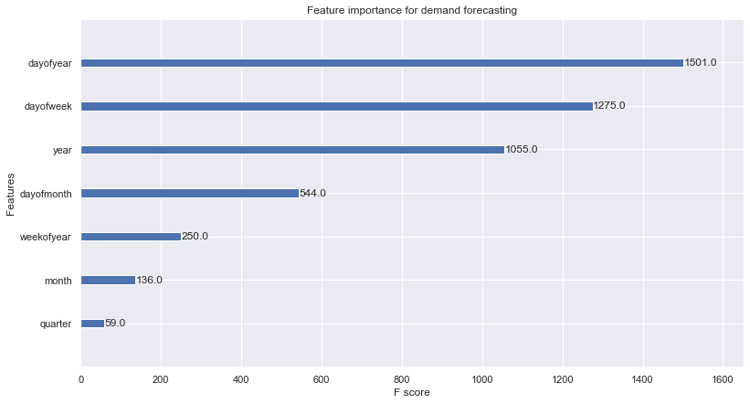
from xgboost import plot_importance

plot_importance(xgb, title='Feature importance for demand forecasting')
plt.show()
horizon_index_12M = pd.date_range('2020-10-07', periods=365, freq='D')
horizon_index_18M = pd.date_range('2020-10-07', periods=548, freq='D')

X_12M = pd.DataFrame(horizon_index_12M.dayofweek, index=horizon_index_12M, columns=['dayofweek'])
X_18M = pd.DataFrame(horizon_index_18M.dayofweek, index=horizon_index_18M, columns=['dayofweek'])

X_12M = feature_engineer_X(X_12M)
X_18M = feature_engineer_X(X_18M)
y_demand_forecast_12M = pd.DataFrame(lr.predict(X_12M) + xgb.predict(X_12M), index=horizon_index_12M, columns=['demand_forecast'])
y_demand_forecast_18M = pd.DataFrame(lr.predict(X_18M) + xgb.predict(X_18M), index=horizon_index_18M, columns=['demand_forecast'])
axs = y_demand_forecast_12M.plot(
    color='red', figsize=(15, 8), subplots=True, sharex=True, alpha=0.8

)
axs = y_demand_forecast_18M.plot(
    color='red', linestyle='--', subplots=True, sharex=True, alpha=0.6, ax=axs,

)
axs = y_demand_fitted[-200:].plot(
    color='blue', subplots=True, sharex=True, ax=axs,
)
axs = df.demand[-200:].plot(
    color='black', marker = 'o', subplots=True, sharex=True, ax=axs, alpha=0.5
)
#axs = y_pred_boosted.plot(
#    color='C3', subplots=True, sharex=True, ax=axs,
#)
#axs.legend([])
plt.legend(['demand forecast 12 months','demand forecast 18 months', 'demand fitted', 'actual demand'])
plt.title('Demand forecast for 12 & 18 months')
plt.ylabel('Demand in MWh')
plt.show()
C:\Users\SD\AppData\Local\Temp\ipykernel_26628\1894236598.py:5: UserWarning: When passing multiple axes, sharex and sharey are ignored. These settings must be specified when creating axes.
  axs = y_demand_forecast_18M.plot(
C:\Users\SD\AppData\Local\Temp\ipykernel_26628\1894236598.py:9: UserWarning: When passing multiple axes, sharex and sharey are ignored. These settings must be specified when creating axes.
  axs = y_demand_fitted[-200:].plot(
C:\Users\SD\AppData\Local\Temp\ipykernel_26628\1894236598.py:12: UserWarning: When passing multiple axes, sharex and sharey are ignored. These settings must be specified when creating axes.
  axs = df.demand[-200:].plot(
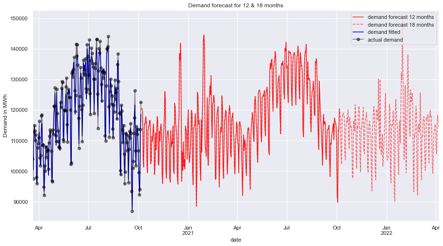
We have got a solid forecast on the demand time series and created the feature demand forecast time series that will help in forecasting the price as well.
Forecasting price
from statsmodels.tsa.seasonal import seasonal_decompose

def plot_periodogram(ts, detrend='linear', ax=None):
    # https://www.kaggle.com/code/ryanholbrook/seasonality/tutorial
    from scipy.signal import periodogram
    fs = pd.Timedelta("1Y") / pd.Timedelta("1D")
    freqencies, spectrum = periodogram(
        ts,
        fs=fs,
        detrend=detrend,
        window="boxcar",
        scaling='spectrum',
    )
    if ax is None:
        _, ax = plt.subplots()
    ax.step(freqencies, spectrum, color="purple")
    ax.set_xscale("log")
    ax.set_xticks([1, 2, 4, 6, 12, 26, 52, 104])
    ax.set_xticklabels(
        [
            "Annual (1)",
            "Semiannual (2)",
            "Quarterly (4)",
            "Bimonthly (6)",
            "Monthly (12)",
            "Biweekly (26)",
            "Weekly (52)",
            "Semiweekly (104)",
        ],
        rotation=30,
    )
    ax.ticklabel_format(axis="y", style="sci", scilimits=(0, 0))
    ax.set_ylabel("Variance")
    ax.set_title("Price Periodogram")
    return ax

fig, axes = plt.subplots(3, 1, figsize=(10,10), gridspec_kw={'height_ratios': [1, 1,2]})
axes[1] = plot_periodogram(df.price, ax=axes[1])
ts_decomposed = seasonal_decompose(df['price'],  model='additive')
axes[0] = ts_decomposed.trend.plot( ax=axes[0])
axes[0].set_title("Price trend component")
axes[0].set_yscale("log")
axes[2] = sns.boxplot(data=df, y='price', showfliers=False)
axes[2].set_title("Price distribution")
plt.show()
C:\Users\SD\AppData\Local\Temp\ipykernel_26628\204507337.py:38: FutureWarning: Units 'M', 'Y' and 'y' do not represent unambiguous timedelta values and will be removed in a future version.
  axes[1] = plot_periodogram(df.price, ax=axes[1])
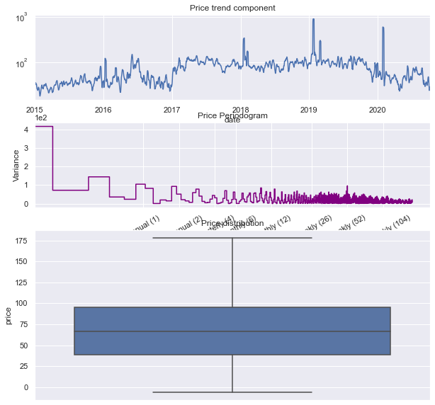
The price time series is hardly trending, it is rather periodically bound inside specific price ranges. This time series does not have particular strong seasonality in any period unlike the demand time series in the earlier modeling. The price distribution has been mostly confined between 38 and 95 AUD with considerable price average extremes above and below that, shown as long whiskers on the box.
Due to this characteristics we choose any classical algorithm for our price model, as trend and seasonality are not big factors. We choose an XGBRegressor model to forecast prices.
from warnings import simplefilter

import matplotlib.pyplot as plt
import numpy as np
import pandas as pd
import seaborn as sns
from sklearn.linear_model import LinearRegression
from sklearn.metrics import mean_squared_error
from sklearn.model_selection import train_test_split
from xgboost import XGBRegressor

simplefilter("ignore")
def make_lags(ts, lags, lead_time=1):
    return pd.concat(
        {
            f'y_lag_{i}': ts.shift(i)
            for i in range(lead_time, lags + lead_time)
        },
        axis=1)


# Four weeks of lag features
y = np.log(df.price.copy())
y_orig = y.copy()
lags = int(1)
X = make_lags(y, lags=lags).fillna(0.0)

# remove cols for XGB
tbd = ['dayofweek',	'quarter',	'month',	'dayofyear',	'dayofmonth',	'weekofyear	']
for col in tbd:
    if col in X.columns:
        X.drop(tbd, axis=1, inplace=True)
        break


def make_multistep_target(ts, steps):
    return pd.concat(
        {f'y_step_{i + 1}': ts.shift(-i)
         for i in range(steps)},
        axis=1)


# Eight-week forecast
y = make_multistep_target(y, steps=1).dropna()

# Shifting has created indexes that don't match. Only keep times for
# which we have both targets and features.
y, X = y.align(X, join='inner', axis=0)
## Feature Engineering

X = feature_engineer_X(X)
#X.drop("year", axis=1, inplace=True)
X['demand_modeled'] = y_demand_fitted
#X.drop('y_lag_1', axis=1,  inplace=True)

X.info()
<class 'pandas.core.frame.DataFrame'>
DatetimeIndex: 2103 entries, 2015-01-01 to 2020-10-06
Data columns (total 9 columns):
 #   Column          Non-Null Count  Dtype
---  ------          --------------  -----
 0   y_lag_1         2103 non-null   float64
 1   dayofweek       2103 non-null   int64
 2   quarter         2103 non-null   int64
 3   month           2103 non-null   int64
 4   year            2103 non-null   int64
 5   dayofyear       2103 non-null   int64
 6   dayofmonth      2103 non-null   int64
 7   weekofyear      2103 non-null   int64
 8   demand_modeled  2103 non-null   float64
dtypes: float64(2), int64(7)
memory usage: 164.3 KB
y.head(3)
| y_step_1 | |
|---|---|
| date | |
| 2015-01-01 | 3.243908 |
| 2015-01-02 | 3.500710 |
| 2015-01-03 | 3.542837 |
X.head(4)
| y_lag_1 | dayofweek | quarter | month | year | dayofyear | dayofmonth | weekofyear | demand_modeled | |
|---|---|---|---|---|---|---|---|---|---|
| date | |||||||||
| 2015-01-01 | 0.000000 | 3 | 1 | 1 | 2015 | 1 | 1 | 1 | 99973.035996 |
| 2015-01-02 | 3.243908 | 4 | 1 | 1 | 2015 | 2 | 2 | 1 | 128306.386960 |
| 2015-01-03 | 3.500710 | 5 | 1 | 1 | 2015 | 3 | 3 | 1 | 140932.607065 |
| 2015-01-04 | 3.542837 | 6 | 1 | 1 | 2015 | 4 | 4 | 1 | 105635.768575 |
# Create splits
X_train, X_test, y_train, y_test = train_test_split(X, y, test_size=0.25, shuffle=False)
#from sklearn.multioutput import MultiOutputRegressor

pp = {'colsample_bytree': 0.6, 'gamma': 0.075, 'learning_rate': 0.04, 'max_depth': 3, 'min_child_weight': 2, 'n_estimators': 200, 'subsample': 0.7}
price_model = XGBRegressor(**pp)
#price_model2 = MultiOutputRegressor(XGBRegressor())
price_model.fit(X_train, y_train)

y_fit = pd.DataFrame(price_model.predict(X_train), index=X_train.index, columns=y.columns)
y_pred = pd.DataFrame(price_model.predict(X_test), index=X_test.index, columns=y.columns)
train_rmse = mean_squared_error(y_train, y_fit, squared=False)
test_rmse = mean_squared_error(y_test, y_pred, squared=False)
print((f"Tuned model: Train RMSE: {train_rmse:.3f}\n" f"Test RMSE: {test_rmse:.3f}"))
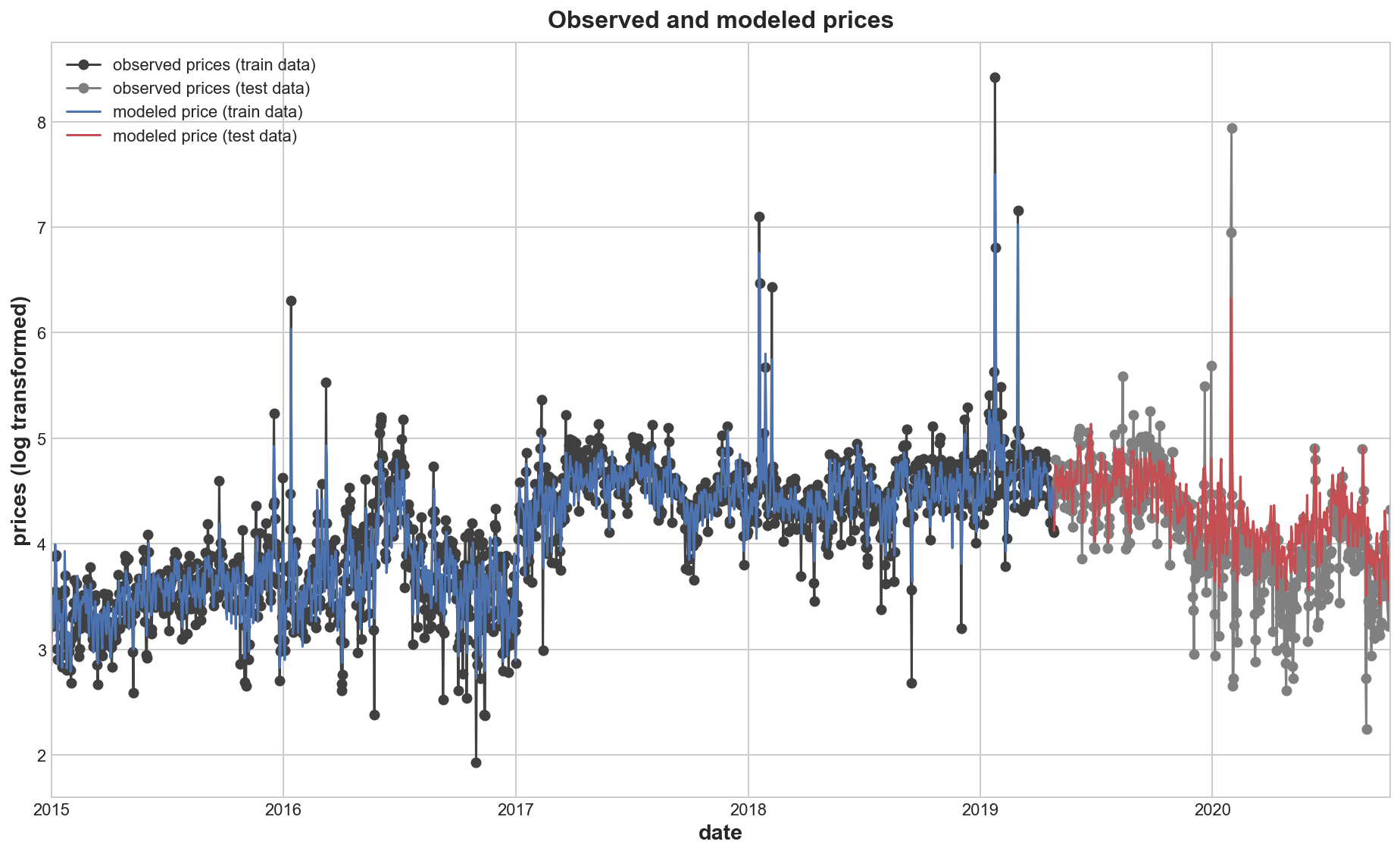
Tuned model: Train RMSE: 0.215
Test RMSE: 0.374
# Set Matplotlib defaults
plt.style.use("seaborn-whitegrid")
plt.rc("figure", autolayout=True, figsize=(11, 4))
plt.rc(
    "axes",
    labelweight="bold",
    labelsize="large",
    titleweight="bold",
    titlesize=16,
    titlepad=10,
)
plot_params = dict(
    color="0.75",
    style=".-",
    markeredgecolor="0.25",
    markerfacecolor="0.25",
)
%config InlineBackend.figure_format = 'retina'


def plot_multistep(y, every=1, ax=None, palette_kwargs=None):
    palette_kwargs_ = dict(palette='husl', n_colors=16, desat=None)
    if palette_kwargs is not None:
        palette_kwargs_.update(palette_kwargs)
    palette = sns.color_palette(**palette_kwargs_)
    if ax is None:
        fig, ax = plt.subplots()
    ax.set_prop_cycle(plt.cycler('color', palette))
    #ax.set_yscale('log')
    for date, preds in y[::every].iterrows():
        preds.index = pd.period_range(start=date, periods=len(preds))
        preds.plot(ax=ax)
    return ax
train_rmse = mean_squared_error(y_train, y_fit, squared=False)
test_rmse = mean_squared_error(y_test, y_pred, squared=False)
print((f"Train RMSE: {train_rmse:.3f}\n" f"Test RMSE: {test_rmse:.3f}"))
MAE = np.mean(np.absolute(y_test.y_step_1 - y_pred.y_step_1))
MAE_Per = 100* MAE/np.mean(y_test.y_step_1)
print(MAE)
print(MAE_Per)
Train RMSE: 0.215
Test RMSE: 0.374
0.2767522987811786
6.698853940866162
axs = y_train.plot(
    color='0.25', figsize=(13, 8), marker = 'o',
    sharex=True,
)
axs = y_test.plot(
    color='0.5', #subplots=True,
    sharex=True, ax=axs, marker = 'o',
)
axs = y_fit.plot(
    color='C0', #subplots=True,
    sharex=True, ax=axs,
)
axs = y_pred.plot(
    color='C3', #subplots=True,
    sharex=True, ax=axs, label="modeled price"
)
axs.legend(["observed prices (train data)", "observed prices (test data)", "modeled price (train data)", "modeled price (test data)"])
plt.ylabel('prices (log transformed)')
plt.title('Observed and modeled prices')
plt.show()
axs = y_test[250:600].plot(
    color='0.25', figsize=(13, 9),
    marker = 'o',
    sharex=True,
)

axs = y_pred[250:600].plot(
    color='C3',
    linewidth=2, #linestyle = '--',
    sharex=True, ax=axs,
    label = 'Forecast'
)

"""axs = y_pred2[250:600].plot(
    color='green',
    linewidth=2, #linestyle = '--',
    sharex=True, ax=axs,
    label = 'Forecast'
)"""

axs.legend(['Actual', 'Forecast'])
plt.ylabel('prices (log transformed)')
plt.title('Zoomed in detail view of the indiviual stepwise forecast prices (test data)')
plt.show()
axs = y_test[350:600].plot(
    color='0.25', figsize=(13, 9),
    marker = 'o',
    sharex=True,
)

axs = y_pred[350:600].plot(
    color='C3',
    linewidth=2, #linestyle = '--',
    sharex=True, ax=axs
)

"""axs = y_pred2[350:600].plot(
    color='green',
    linewidth=2, linestyle = '--',
    sharex=True, ax=axs
)
"""
axs.legend(['Actual', 'Forecast', 'Forecast (unoptimized model)'])
plt.ylabel('prices (log transformed)')
plt.title('Zoomed in detail view of the indiviual stepwise forecast prices (test data)')
plt.show()
from xgboost import plot_importance
plot_importance(price_model, title='Feature importance in our price model')
plt.show()
Forecast Price for 12 & 18 months
X_12M = pd.DataFrame(horizon_index_12M.dayofweek, index=horizon_index_12M, columns=['dayofweek'])
X_18M = pd.DataFrame(horizon_index_18M.dayofweek, index=horizon_index_18M, columns=['dayofweek'])

X_12M = make_lags(X_12M, lags=lags).fillna(0.0)
X_18M = make_lags(X_18M, lags=lags).fillna(0.0)

X_12M = feature_engineer_X(X_12M)
#X_12M.drop("year", axis=1, inplace=True)
X_12M['demand'] = y_demand_forecast_12M
X_18M = feature_engineer_X(X_18M)
#X_18M.drop("year", axis=1, inplace=True)
X_18M['demand'] = y_demand_forecast_18M
#X_12M.drop('dayofweek', axis=1, inplace=True)
#X_18M.drop('dayofweek', axis=1, inplace=True)
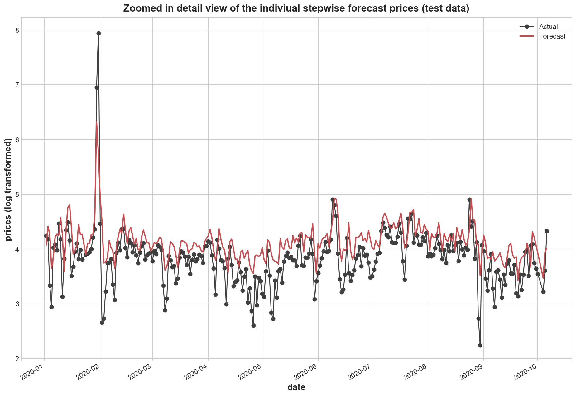
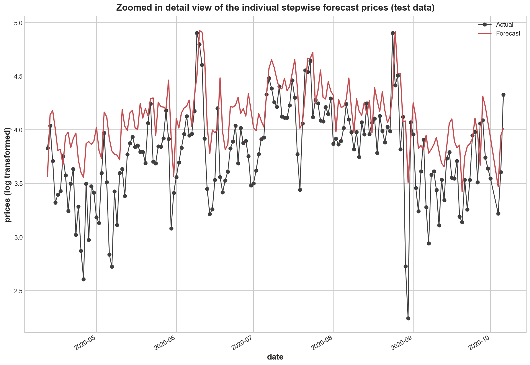
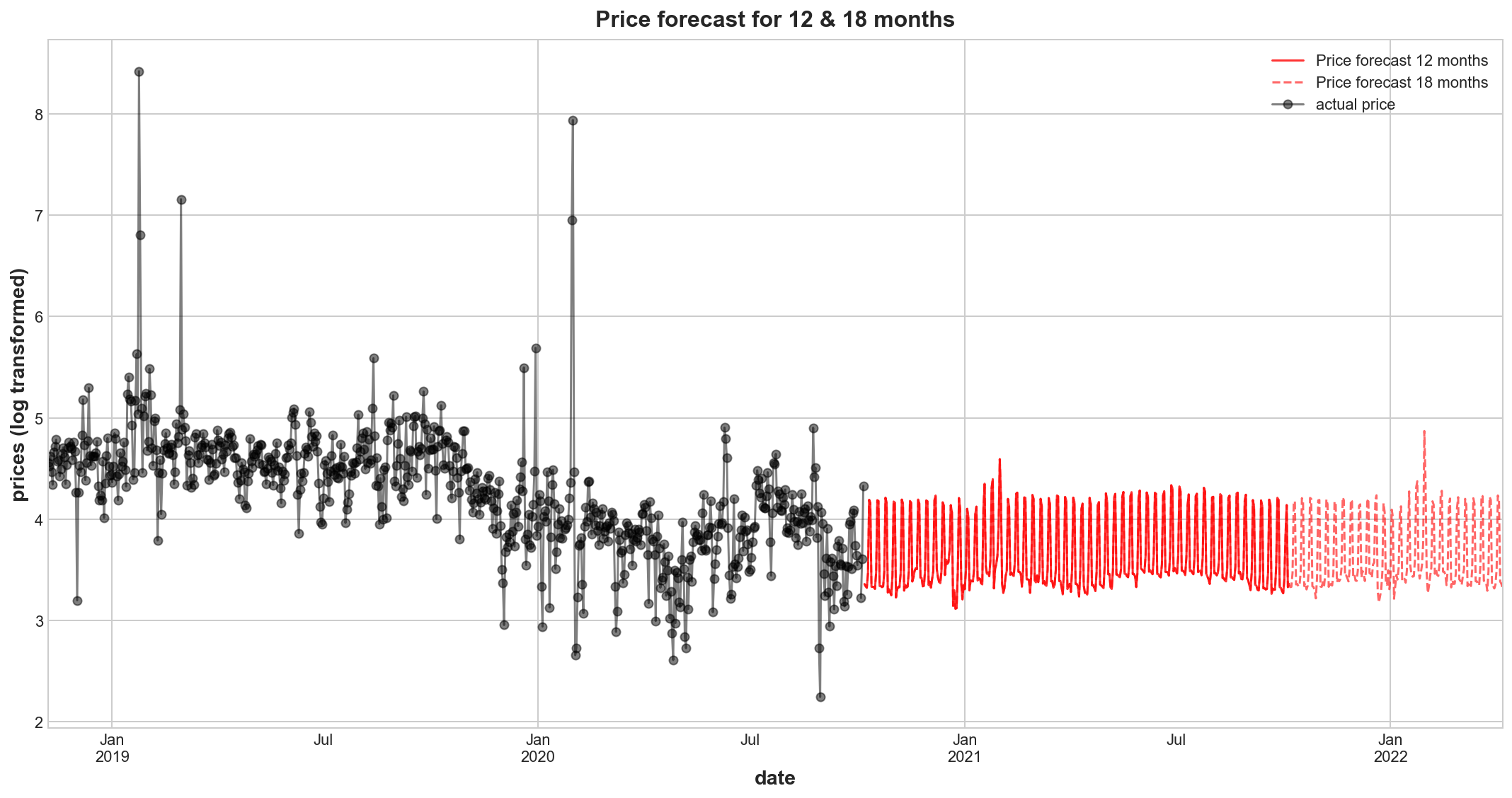
For this forecast we introduce a manual pricetrend adjustment component as we believe the price reverts back to the range of the years 2015 to 2016 and also 2020. The latter could not be used for training the model, as it was designated testing data. There have been probably structural effects in the market that caused wholesale electricity prices in 2017 to 19 to rise into a logarithmic price band between 4 and 5, instead of below 4. Such reasons could have been shortened supply (decommission power plants), specific costs of transforming australia’s energy mix to become more sustainable etc. These can be confirmed with local domain experts. In its absence, I do not expect considerable price trend change expect falling back to the previous price range, that has been reestablished in 2020 year to date. Only a qualitative assessment will be able to give a guidance on the price level, only seasonal and cyclical spikes can be predicted on a daily level, which are rather of less interest here.
#y_pred = pd.DataFrame(model.predict(X_12M), index=horizon_index_12M, columns=['price_forecast'])
pricetrend_adj = -0.5

y_price_forecast_12M = pd.DataFrame(price_model.predict(X_12M)+pricetrend_adj, index=horizon_index_12M, columns=['price_forecast'])
y_price_forecast_18M = pd.DataFrame(price_model.predict(X_18M)+pricetrend_adj, index=horizon_index_18M, columns=['price_forecast'])
axs = y_price_forecast_12M.plot(
    color='red', figsize=(15, 8), subplots=True, sharex=True, alpha=0.8

)
axs = y_price_forecast_18M.plot(
    color='red', linestyle='--', subplots=True, sharex=True, alpha=0.6, ax=axs,

)
#axs = y_pred[-700:].plot(
#    color='blue', subplots=True, sharex=True, ax=axs,
#)
axs = np.log(df.price[-700:]).plot(
    color='black', marker = 'o', subplots=True, sharex=True, ax=axs, alpha=0.5
)
#axs = y_pred_boosted.plot(
#    color='C3', subplots=True, sharex=True, ax=axs,
#)
#axs.legend([])
plt.legend(['Price forecast 12 months','Price forecast 18 months',
            #'price fitted',
            'actual price'])
plt.title('Price forecast for 12 & 18 months')
plt.ylabel('prices (log transformed)')
plt.show()
fig, axes = plt.subplots(1, 10, sharey=True, figsize=(14,8))
fig.suptitle('Price distributions comparison between actual prices (blue) and modeled prices (orange) ex outliers')
pal = sns.color_palette("PuBu", 12); pal2=sns.color_palette("OrRd", 10)
sns.boxplot(data=df['2015'],  y='price', showfliers = False, ax=axes[0], color=pal[4])
axes[0].set_title('year 2015')
sns.boxplot(data=df['2016'],  y='price', showfliers = False, ax=axes[1], color=pal[5])
axes[1].set_title('year 2016')
sns.boxplot(data=df['2017'],  y='price', showfliers = False, ax=axes[2], color=pal[6])
axes[2].set_title('year 2017')
sns.boxplot(data=df['2018'],  y='price', showfliers = False, ax=axes[3], color=pal[7])
axes[3].set_title('year 2018')
sns.boxplot(data=df['2019'],  y='price', showfliers = False, ax=axes[4], color=pal[8])
axes[4].set_title('year 2019')
sns.boxplot(data=df['2020'],  y='price', showfliers = False, ax=axes[5], color=pal[9])
axes[5].set_title('year 2020 YTD')
sns.boxplot(data=df,  y='price', showfliers = False, ax=axes[6], color=pal[10])
axes[6].set_title("years 2015-2020")
sns.boxplot(y=np.exp(y_fit.y_step_1), showfliers = False, ax=axes[7], color=pal2[3])
axes[7].set_title("modeled prices\n training")
sns.boxplot(y=np.exp(y_price_forecast_12M['price_forecast']), showfliers = False, ax=axes[8], color=pal2[5])
axes[8].set_title("forecast prices\n 12 months")
sns.boxplot(y=np.exp(y_price_forecast_18M['price_forecast']), showfliers = False,  ax=axes[9], color=pal2[5])
axes[9].set_title("forecast prices\n 18 months")
plt.show()
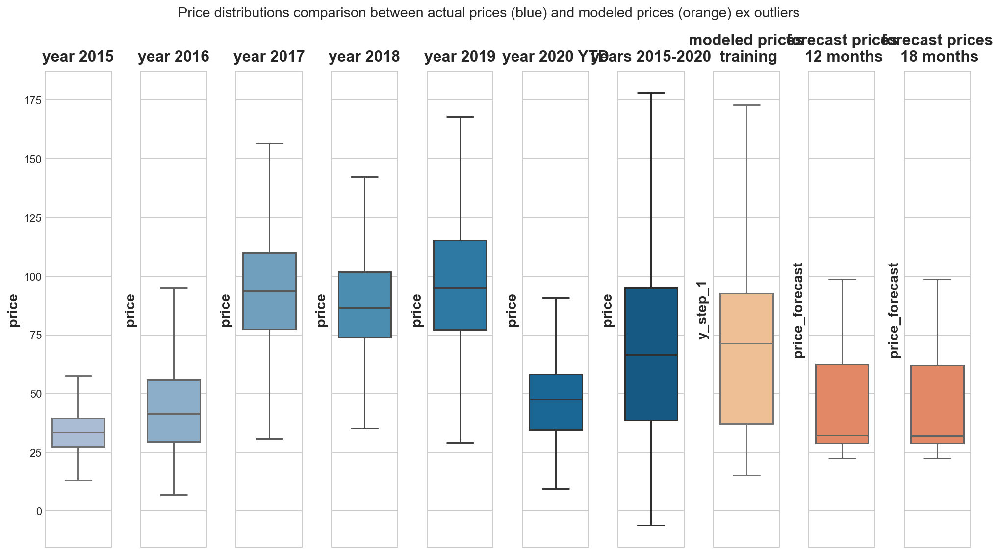
The forecast prices lack external shocks and its induced price spikes and therefore are confined to relatively narrow price ranges in comparison to real observed prices. These price shocks cannot be modeled with the given data. This price spiking and volatility is expected to rise generally in this electricity market (see figure). It is a market, in which base loads from less desirable conventional power plants cannot be taken for granted any longer. And for our purpose, where our price comittee requires a guidance for contract price negotations, I assume that we want to plan financial numbers conservatively and do not really require daily resolution of a price development. So we could consider our SARIMA half monthly price model as well.
3. Provide guidance on how much revenue the energy storage venture could generate per year using retail prices and a 70MWh storage system.
modeling storage business
import random
# set up required cols
df['stored_energy'] = 0
df['revenue_negprices'] = 0
df['revenue_regular'] = 0
df['year'] = df.index.year

# function to determine daily if and how much energy is favourable to be stored and how much revenue could have been made (ex post)
def energy_storage(df, index, row, MWh):
        # sell stored energy as soon as price is somehow favourable at avg spot price
        loc = df.index.get_loc(index) # integer index
        if df.iloc[loc-1]['stored_energy'] > 0:
            df.loc[index, 'revenue_regular'] = df.iloc[loc-1]['stored_energy'] * row.price_positive
            df.loc[index, 'stored_energy'] = 0

        # unfavourable market prices for selling electricity
        if row.price_negative < 0:
            # A. we store our own produced PV energy free of cost or
            # B. we sell our storage capacity for market price and earn revenue by 'buying' electricity at negative prices
            # the chance is simplified and assumed to 50%/50% suntime/nighttime
            suntime = random.choice([0, 1])
            if row.demand_neg_price > MWh * 2 & suntime == 1: # suntime situation is large and long enough to fill 70MWh storage
                df.loc[index, 'stored_energy'] = MWh
                df.loc[index, 'revenue_negprices'] = 0 # not yet sold, but we may have avoided buying spot energy storage
            elif row.demand_neg_price > MWh * 2 & suntime == 0: # night
                df.loc[index, 'stored_energy'] = MWh
                df.loc[index, 'revenue_negprices'] = MWh * row.price_negative * -1

for index, row in df.iterrows():
    energy_storage(df, index, row, MWh=70)
sns.set(rc={"figure.figsize":(13, 7)})

df['total_storage_revenue'] = df.revenue_negprices + df.revenue_regular
fig, axes = plt.subplots(3, 1, figsize=(13,15), gridspec_kw={'height_ratios': [1, 1,1]})

axes[0] = df.groupby(['year', 'quarter'])[['revenue_negprices','revenue_regular']].sum().plot(kind='bar', stacked=True, ax=axes[0])
axes[0].legend(['Selling storage capacity (Revenue by negative prices)','Re-(selling) stored electricty at favourable prices'])
axes[0].set_title('Revenues by Selling storage capacity & Re-(selling) stored electricity at favourable prices')
axes[0].set_ylabel('Revenue in AUD')

df['total_storage_revenue'] = df.revenue_negprices + df.revenue_regular
axes[1] = df.groupby(['year'])[['revenue_negprices','revenue_regular']].sum().plot(kind='bar', stacked=True, ax=axes[1])
axes[1].legend(['Selling storage capacity (Revenue by negative prices)','Re-(selling) stored electricty at favourable prices'])
axes[1].set_title('Revenues by Selling storage capacity & Re-(selling) stored electricity at favourable prices')
#ax = plt.gca() # get axis
axes[1].set_xticks([0,1,2,3,4,5])
axes[1].set_xticklabels(['2015', '2016', '2017', '2018', '2019', '2020 YTD'], rotation=45)
axes[1].set_ylabel('Revenue in AUD')

rev_yearly = df.groupby(['year'])[['revenue_negprices','revenue_regular']].sum()
rev_yearly['total'] = rev_yearly.revenue_negprices + rev_yearly.revenue_regular
axes[2] = sns.boxplot(data=rev_yearly, y='total')
axes[2].set_title('Yearly Total Electricity Storage Revenue distribution 2015-2020 YTD')
axes[2].set_ylabel('Total revenue per year in AUD')
plt.show()
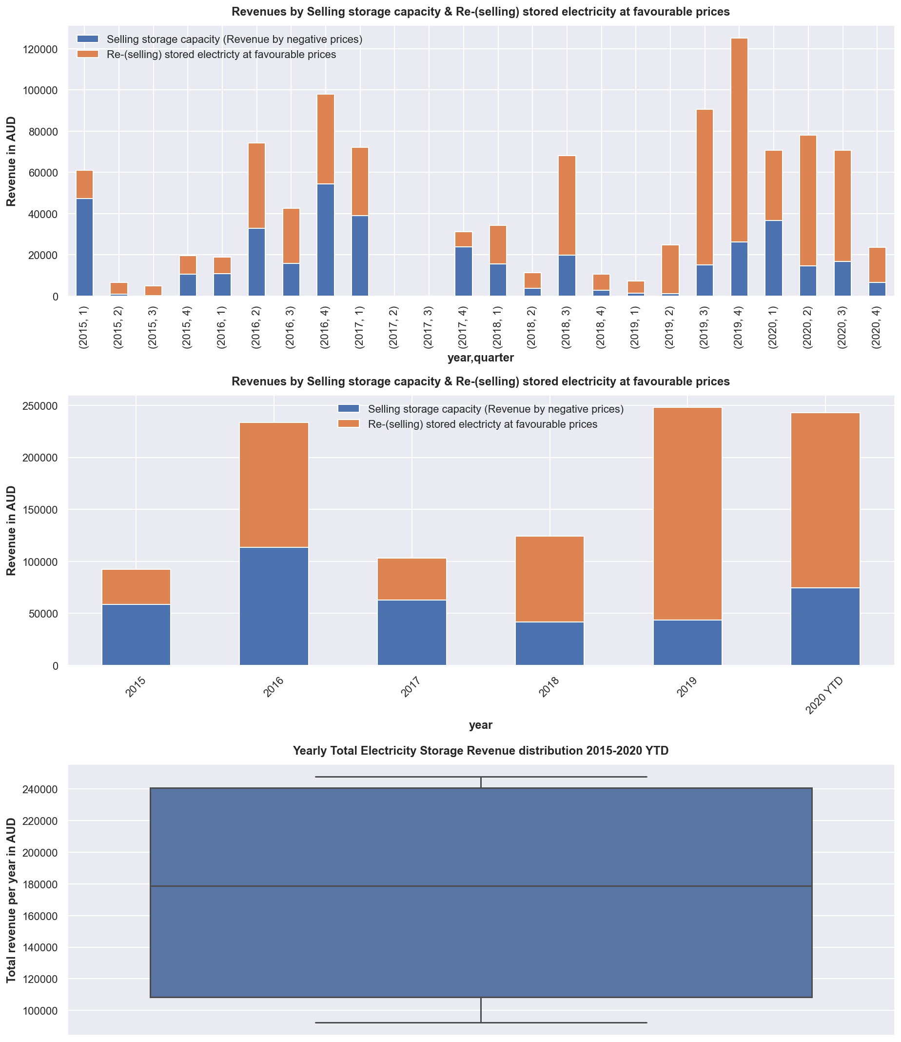
print((f"Yearly 25% Percentile: {rev_yearly['total'].describe()[4]:.0f}"))
print((f"Yearly 75% Percentile: {rev_yearly['total'].describe()[6]:.0f}"))
print((f"Yearly Average: {rev_yearly['total'].describe()[1]:.0f}"))
Yearly 25% Percentile: 108542
Yearly 75% Percentile: 240657
Yearly Average: 174024
rev_yearly['total'].describe()
count         6.000000
mean     174024.206780
std       74740.389903
min       92247.097306
25%      108542.000211
50%      178795.248394
75%      240656.883464
max      247905.967280
Name: total, dtype: float64
from statsmodels.tsa.seasonal import seasonal_decompose
fig2, axes = plt.subplots(2, 1, figsize=(13, 10), constrained_layout=False)
monthly = df.resample('M').mean()
sub1 = sns.barplot(y=monthly.frac_neg_price, x=monthly.index, palette="Blues_d", ax = axes[0])
ticklabels = [monthly.index[int(tick)].strftime('%Y-%m') for tick in sub1.get_xticks()]
sub1.set_xticklabels(ticklabels,rotation=90)
sub1.set_title('monthly mean')
decomp = seasonal_decompose(monthly.frac_neg_price,period=12)
sub2 = decomp.trend.plot(ax = axes[1])
sub2.set_title('isolated monthly trend component pointing upwards')
plt.suptitle('Monthly average of daily fractions, in which transactions traded at negative prices')
plt.subplots_adjust(hspace = 0.5)
plt.show()
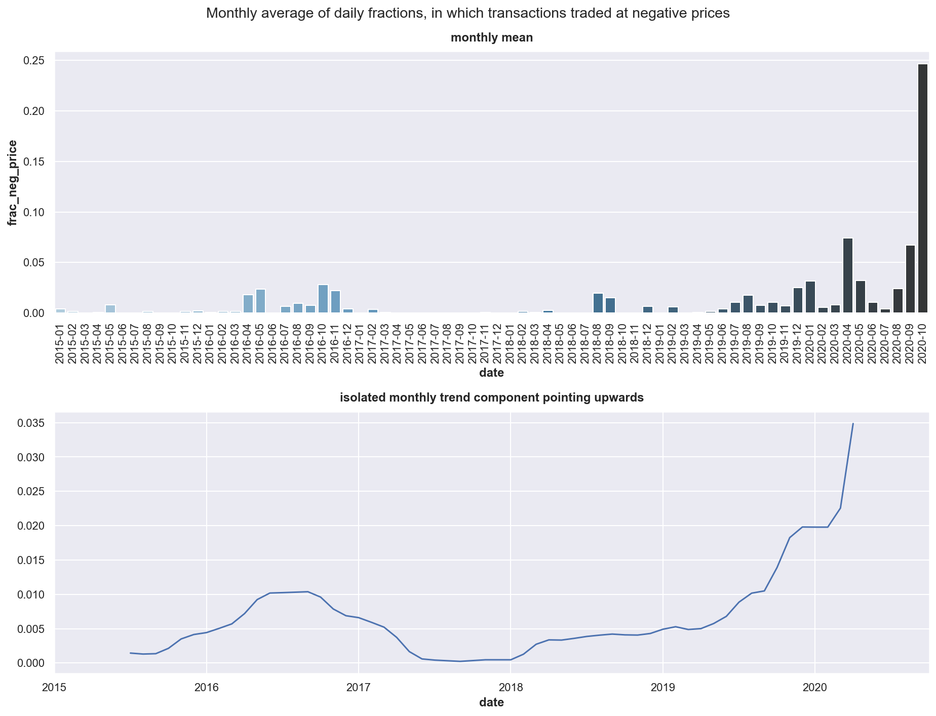
As guidance on how much revenue the storage venture can produce per year we have seen the chart and depending on how conservative you may want to plan, you can refer to the first or third quartile or just the yearly average of 174K AUD, which can be used to calculate against costs involved. As we have seen the trend to negative prices is strong, which can be explained with more sustainable electricity being produced by solar and wind which has more volatile production outputs and hence volatile prices and price spikes both up and down as well.