Statistical Process Control with automatically generated Control Charts in Python
Statistical Process Control Charts originate from industrial technical applications but can be applied for all sorts of processes as long as its data is collected so its performance can be analysed.
Typical Applications of control charts
-
classical industrial: technical measurement readings or defects counts in manufacturing processes: e.g. part & tool dimensions etc.
-
in non-manufacturing contexts: variables and attributes that allow to control & monitor of service processes etc.
Examples of variables and attributes for generic logistics & supply chain use:
- Monthly employee attrition %
- Daily % delivery shipments off distribution center before cutoff time YZ
- turnaround times of process activities
- (internal) customer satisfaction scores
- Daily % of on-time deliveries on sku level
Process Activity XY
Let’s say we are particularly interested in the durations of a fictious process activity XY. Management has specified acceptable duration limits derived from the Voice of Customer for that process activity:
# Upper specification limit value:
USL = 1.7
# Lower specification limit value:
LSL = 0.2
We will control the process by taking samples of 10 variable measurements (subgroups) daily and monitor the process activities’ turnaround times with the subgroups mean and its standard deviation. This corresponds to the Xbar-S Chart.
Typology of Statistical Process Control Charts
 Source: https://www.sixsigmatrainingfree.com/statistical-process-control-charts.html
import numpy as np
import pandas as pd
import matplotlib.pyplot as plt
%matplotlib inline
import seaborn as sns
import numpy as np
durations_XY = pd.read_csv("process_activity_turnaroundtimes.csv", index_col='subgroup')
durations_XY
| sample item 1 | sample item 2 | sample item 3 | sample item 4 | sample item 5 | sample item 6 | sample item 7 | sample item 8 | sample item 9 | sample item 10 | |
|---|---|---|---|---|---|---|---|---|---|---|
| subgroup | ||||||||||
| 1 | 0.8814 | 0.9330 | 0.9762 | 0.8472 | 0.8838 | 0.4434 | 0.9654 | 0.6138 | 0.4878 | 0.8580 |
| 2 | 0.8802 | 0.8790 | 0.7776 | 1.0206 | 0.5100 | 0.6810 | 0.7848 | 0.5652 | 0.4344 | 0.8388 |
| 3 | 0.9192 | 0.6588 | 1.0662 | 0.7938 | 0.6666 | 0.6654 | 0.6852 | 0.9330 | 0.8616 | 0.7176 |
| 4 | 1.0662 | 0.8004 | 0.8112 | 0.8856 | 0.6840 | 0.6462 | 0.9996 | 0.8124 | 0.9330 | 0.6714 |
| 5 | 0.8220 | 1.0662 | 0.7896 | 1.0644 | 0.6966 | 0.7128 | 0.8034 | 0.9330 | 0.8538 | 0.7092 |
| 6 | 0.7404 | 1.0494 | 0.8706 | 0.6990 | 0.7698 | 0.8592 | 0.9912 | 0.7986 | 0.8472 | 0.7308 |
| 7 | 0.9408 | 0.8238 | 0.9480 | 1.1508 | 0.6936 | 0.9432 | 1.0650 | 0.6624 | 0.5652 | 0.9624 |
| 8 | 1.0218 | 0.9036 | 0.6612 | 0.8010 | 0.7488 | 1.0518 | 0.6138 | 0.7158 | 1.0080 | 1.0044 |
| 9 | 0.6678 | 0.8814 | 0.9552 | 0.9624 | 0.7548 | 0.9876 | 0.8754 | 0.9192 | 0.8082 | 0.5700 |
| 10 | 0.7932 | 0.7734 | 0.6990 | 0.8964 | 0.8394 | 0.7440 | 0.7296 | 0.8880 | 0.9540 | 0.6810 |
| 11 | 0.8814 | 0.9348 | 0.9762 | 0.8472 | 0.8838 | 0.9270 | 0.9762 | 0.7386 | 0.9018 | 0.8988 |
| 12 | 1.1064 | 0.8208 | 0.9072 | 0.7578 | 1.0122 | 1.0356 | 1.1514 | 0.7422 | 0.8286 | 0.8970 |
| 13 | 0.8538 | 0.9090 | 0.9288 | 0.8622 | 1.1340 | 0.9372 | 0.9264 | 0.9474 | 0.6762 | 1.0608 |
| 14 | 0.6972 | 0.8466 | 1.1826 | 1.0092 | 0.9330 | 0.7962 | 0.8580 | 0.8232 | 0.6666 | 0.8226 |
| 15 | 0.8982 | 1.0476 | 0.9246 | 0.9984 | 0.7332 | 0.6666 | 0.8754 | 0.9144 | 0.6858 | 0.6666 |
durations_array = np.array(durations_XY).flatten()

sns.histplot(durations_array, stat='density')
sns.kdeplot(durations_array, color="green", label="Density")
plt.axvline(LSL, linestyle="--", color="red", label="LSL")
plt.axvline(USL, linestyle="--", color="orange", label="USL")
plt.title('Histogramm durations process activity XY across all subgroups')
plt.legend()
plt.show()
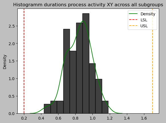
This duration data looks pretty much normally distributed at first sight. In order to proceed with the Xbar-S control chart as intended, we will formalize this subjective histogram assessment with a statistical Anderson Darling test for normality.
from scipy.stats import anderson

print('test statistic:', anderson(durations_array)[0])
print('critical statistic values:', anderson(durations_array)[1])
print('significance levels:', anderson(durations_array)[2]/100)

if anderson(durations_array)[0] < min(anderson(durations_array)[1]):
    print('Sample looks normally distributed (gaussian) (fail to reject H0)')
else:
    print('Sample looks normally distributed (gaussian) (reject H0)')
test statistic: 0.47046168162401614
critical statistic values: [0.562 0.64  0.767 0.895 1.065]
significance levels: [0.15  0.1   0.05  0.025 0.01 ]
Sample looks normally distributed (gaussian) (fail to reject H0)
Our Darling Anderson test statistic is lower than all critical statistic values corresponding to the array of reasonable Significance Levels $ \alpha $.
So there is no reason to doubt that we are dealing with normally distributed data and proceed with Xbar-S and the pyspc package.
Python Package ‘pyspc’ to create control charts
- apart from a few examples no documentation
- need to look into code to understand how it works
- only partially implemented
https://github.com/carlosqsilva/pyspc
#!pip install pyspc
import pyspc as spc
X bar S Charts
from pyspc import *
a = spc(durations_XY) + xbar_sbar() + sbar() + rules()
print(a)
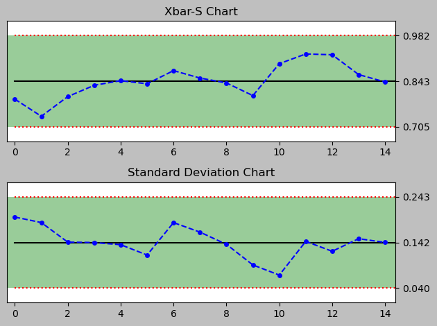
<pyspc: (-9223371849240834904)>
Process Capability of current process activity
def process_capability(df, USL, LSL):
    """
    Calculate both
    Process Capability Indices Cp and Cpk
    Process Performance Indices Pp and Ppk
    given the specification limits USL and LSL
    """
    import numpy as np

    n = df.shape[1]

    if n <= 4:
        # sigma estimation: n = 1 to 4
        Rbar = df.max(axis = 1) - df.min(axis = 1)
        sigma_within_subgroups = np.mean(Rbar) / d2[df.shape[1]]
    else:
        #sigma estimation n > 4
        sbar = np.mean(df.std(axis = 1))
        sigma_within_subgroups = sbar / c4[df.shape[1]]

    sigma_overall = np.std(df.values.flatten())
    mju = np.mean(df.values.flatten())

    # Calculate Cp Potential Capability
    Cp = np.round((USL - LSL)/(6 * sigma_within_subgroups), 3)

    # Calculate Pp Potential Performance
    Pp = np.round((USL - LSL)/(6 * sigma_overall), 3)

    # Calculate Cpk Actual Capability
    Cp_upper = (USL - mju) / (3 * sigma_within_subgroups)
    Cp_lower = (mju - LSL) / (3 * sigma_within_subgroups)
    Cpk = np.round(np.min([Cp_upper, Cp_lower]),3)

    # Calculate Pp Potential Performance
    Pp_upper = (USL - mju) / (3 * sigma_overall)
    Pp_lower = (mju - LSL) / (3 * sigma_overall)
    Ppk = np.round(np.min([Pp_upper, Pp_lower]),3)

    return Cp, Cpk, Pp, Ppk
# Process Capability Analysis

Cp, Cpk, Pp, Ppk = process_capability(durations_XY, USL, LSL)
oldCp, oldCpk, oldPp, oldPpk = Cp, Cpk, Pp, Ppk
indices = iter(['Cp', 'Cpk', 'Pp', 'Ppk'])
_ = [print(next(indices) + ': ', i) for i in [Cp, Cpk, Pp, Ppk]]
Cp:  1.717
Cpk:  1.473
Pp:  1.706
Ppk:  1.464
Our fictious process activity XY is apparently capable of achieving the results that the specification limits asked for, as both Cpk and Ppk are way larger than 1 and preferable larger than 1.3. This is the case here.
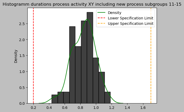
This result is the baseline for a process change that is considered to be implemented. This process activity XY is offered to be outsourced by a custom external process activity XY that promises cost reductions of overall 40%.
However this process is not as capable as our own in-house process in comparison, due to shared resources and priorities and a lowered service level that is considered.
The proposed service level agreement allows for 0.2 higher process duration on average and 0.2 higher standard deviation compared from current levels. Let’s examine that.
# New process properties:

# Upper specification limit value:
mean_duration_delta = 0.2
# Lower specification limit value:
std_duration_delta = 0.2
Changing process (e.g. Outsourcing)
from numpy.random import default_rng
rng = default_rng(1)

newdata_seq_length = 5
durations_XY.loc[11:16] = durations_XY.loc[11:16] + rng.normal(mean_duration_delta,std_duration_delta ,[newdata_seq_length,10])
import numpy as np

durations_array = np.array(durations_XY).flatten()

sns.histplot(durations_array, stat='density')
sns.kdeplot(durations_array, color="green", label="Density")
plt.axvline(LSL, linestyle="--", color="red", label="Lower Specification Limit")
plt.axvline(USL, linestyle="--", color="orange", label="Upper Specification Limit")
plt.title('Histogramm durations process activity XY including new process subgroups 11-15')
plt.legend()
plt.show()
print('test statistic:', anderson(durations_array)[0])
print('critical statistic values:', anderson(durations_array)[1])
print('significance levels:', anderson(durations_array)[2]/100)

# H0: Sample is normally distributed (gaussian)

if anderson(durations_array)[0] < min(anderson(durations_array)[1]):
    print('Sample is assumed to be normally distributed (gaussian) (fail to reject H0)')
else:
    print('A normal distribution cannot be assumed with any reasonable significance level (reject H0)')
test statistic: 0.574353947210227
critical statistic values: [0.562 0.64  0.767 0.895 1.065]
significance levels: [0.15  0.1   0.05  0.025 0.01 ]
A normal distribution cannot be assumed with any reasonable significance level (reject H0)
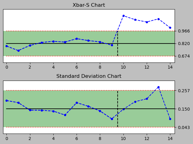
import numpy as np

a = spc(data = durations_XY.loc[0:10]
        , newdata = durations_XY.loc[11:16]
       ) + xbar_sbar() + sbar() + rules()
print(a)

<pyspc: (-9223371849241062204)>
Process Capability of changed process activity
# Process Capability Analysis

print('Legend', ['old', 'new'])
Cp, Cpk, Pp, Ppk = process_capability(durations_XY, USL, LSL)
indices = iter(['Cp', 'Cpk', 'Pp', 'Ppk'])
_ = [print(next(indices) + ': ', i) for i in [[oldCp, Cp], [oldCpk, Cpk], [oldPp, Pp], [oldPpk, Ppk]]]
Legend ['old', 'new']
Cp:  [1.717, 1.511]
Cpk:  [1.473, 1.426]
Pp:  [1.706, 1.215]
Ppk:  [1.464, 1.147]


"\nLegend ['old', 'new']\nCp:  [1.809, 1.605]\nCpk:  [1.552, 1.515]\nPp:  [1.706, 1.215]\nPpk:  [1.464, 1.147]\n    "
Conclusion
As expected, the performance of the outsourced process at his point in time is lower than our current process. While this is true the indices are still over 1, meaning favourable and it remains to be seen if the customer is able to notice any difference. So, this process change may be of interest and seems feasible, while it is subject to further qualitative evaluation.
To ease transition, the process activity workload could be split up into the in house and external variant to maintain the flexibility to switch back in-house (partially) at any time. If and when signs occur that the process capability declines e.g. particularly in a high season phase where a higher workload has to be dealt with. Such problems can be monitored closely with statistical process control charts.
So at this point in time, we just don’t know if this outsourcing decision is one that may be suited for also high workloads or other situations, this will have to be tested.
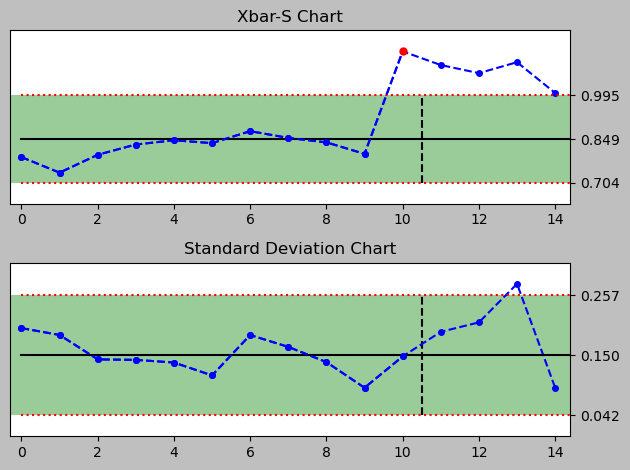
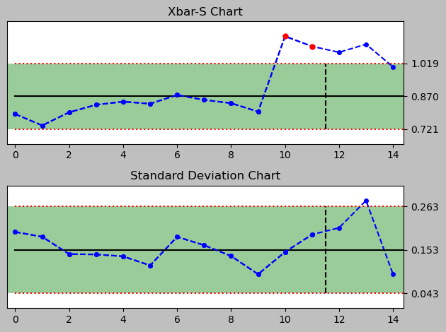
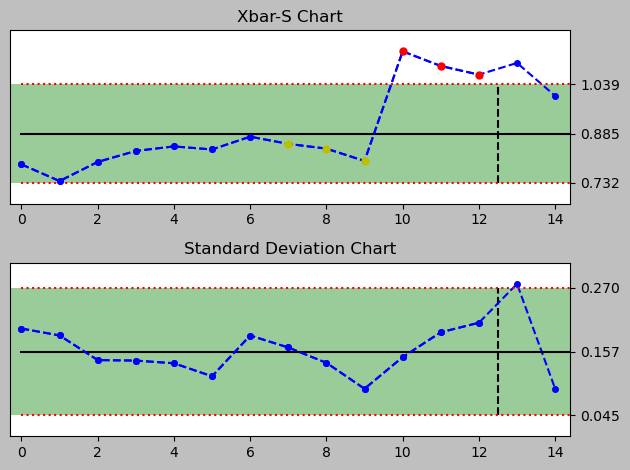
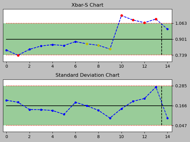
Bonus: how did the switch to the new process activity get picked up by its Xbar S Charts?
For that I quickly generate a series of control charts for each day to see how well the chart signals through the Nelson rules that there is a deviation due to the new data introduced by the alternative process implementation and its changed Xbar and standard deviation.
import numpy as np

last_old_data_index = 10

for i in np.arange(1,newdata_seq_length+1):
    print(f"day {i} (vertical line separates old data from new data)")
    chart = spc(
                data = durations_XY.loc[0:last_old_data_index+i-1],
                newdata = durations_XY.loc[last_old_data_index+i:last_old_data_index+newdata_seq_length],
               ) + xbar_sbar() + sbar() + rules()
    print(chart)
day 1 (vertical line separates old data from new data)
<pyspc: (-9223371849241033568)>
day 2 (vertical line separates old data from new data)
<pyspc: (-9223371849240820720)>
day 3 (vertical line separates old data from new data)
<pyspc: (-9223371849246322136)>
day 4 (vertical line separates old data from new data)
<pyspc: (-9223371849241748208)>
day 5 (vertical line separates old data from new data)
<pyspc: (-9223371849240789972)>
There are signals drawn into the plot, even though there are a just two rules implemented in this python package version 0.4.0.
A full set of Nelson Rules would comprise eight rules and allow a much narrower monitoring, especially of several subtle observations that can be helpful in assessing a process closely. Currently implemented are rules #1 and #7. More rules can be added in the file rules.py.
With python we can automate the control and monitoring of any set of processes with statistical process charts and there is no need to handle Minitab or excel manually.